None Shall Remain Brand System
A cross-platform identity designed to help a post-punk band stand apart from the category’s familiar dark, gothic visual language.
The challenge
None Shall Remain needed a visual identity that felt credible within post-punk without disappearing into the same black-on-black gothic imagery used throughout the category.
The system also had to stretch well beyond a logo. It needed to work across the band’s website, performance promotion, social video, merchandise, and recurring announcements.
The direction
I used punk collage, stark black-and-white photography, and an electric pink accent to create something abrasive, energetic, and immediately recognizable.
The visual direction drew inspiration from the raw cut-and-paste impact of the Misfits’ Walk Among Us, then translated that attitude into a flexible digital system.
Handmade textures, rough marks, sharp silhouettes, and photographic cutouts established a shared vocabulary. Repeating those elements allowed the website, social posts, motion pieces, and merchandise to feel related.
The website system
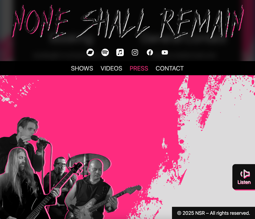
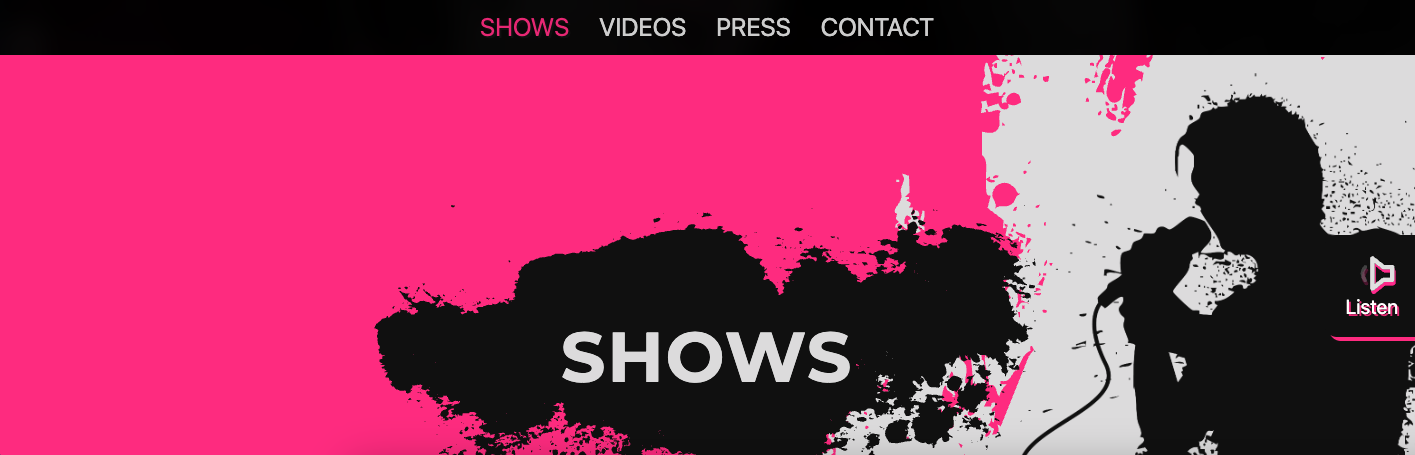
An earlier version of the website carried the collage language further through layered photography, vector textures, silhouettes, and parallax movement.
The footer assembled individual band portraits into one electric-pink composition. A performance silhouette echoed the treatment used in the Meet the Band reel, connecting the website and social campaign through a shared visual device.
Motion and social
Short-form videos extended the identity through pacing, typography, image treatment, and movement.
Merchandise
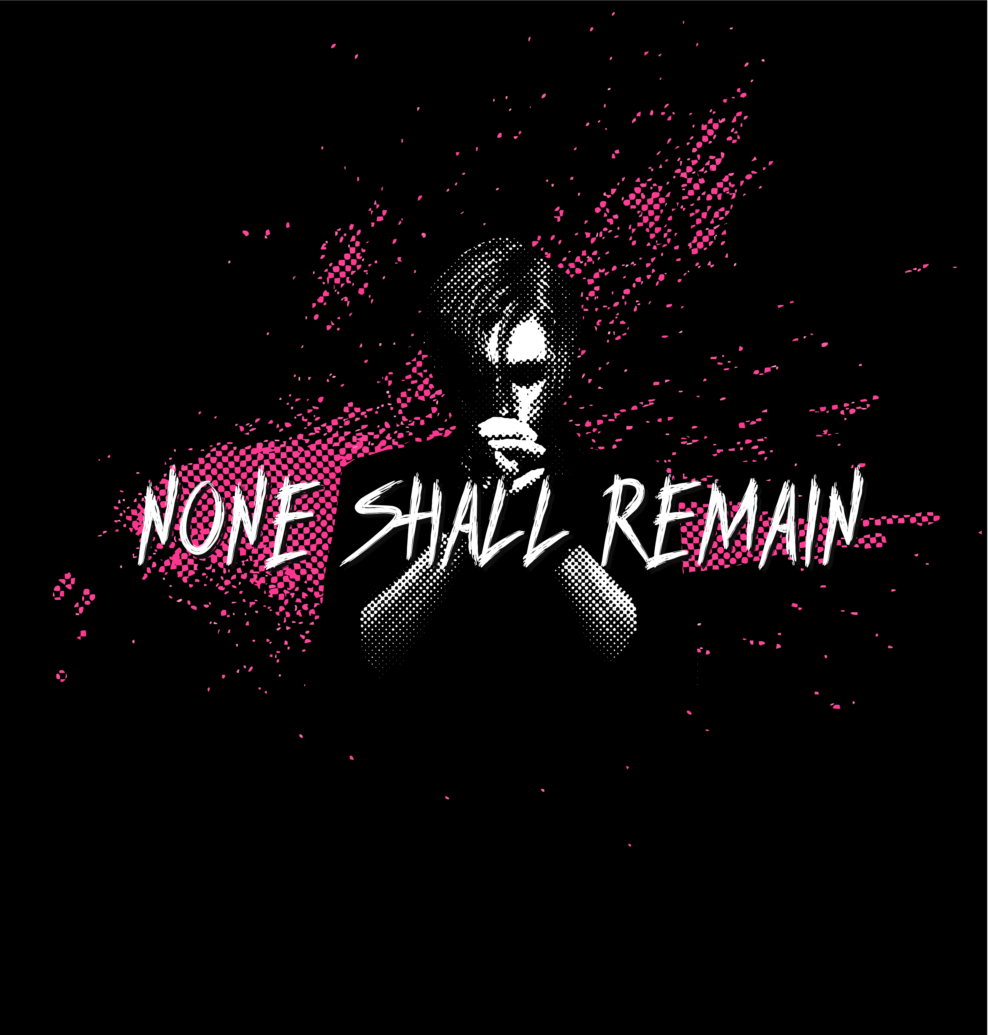
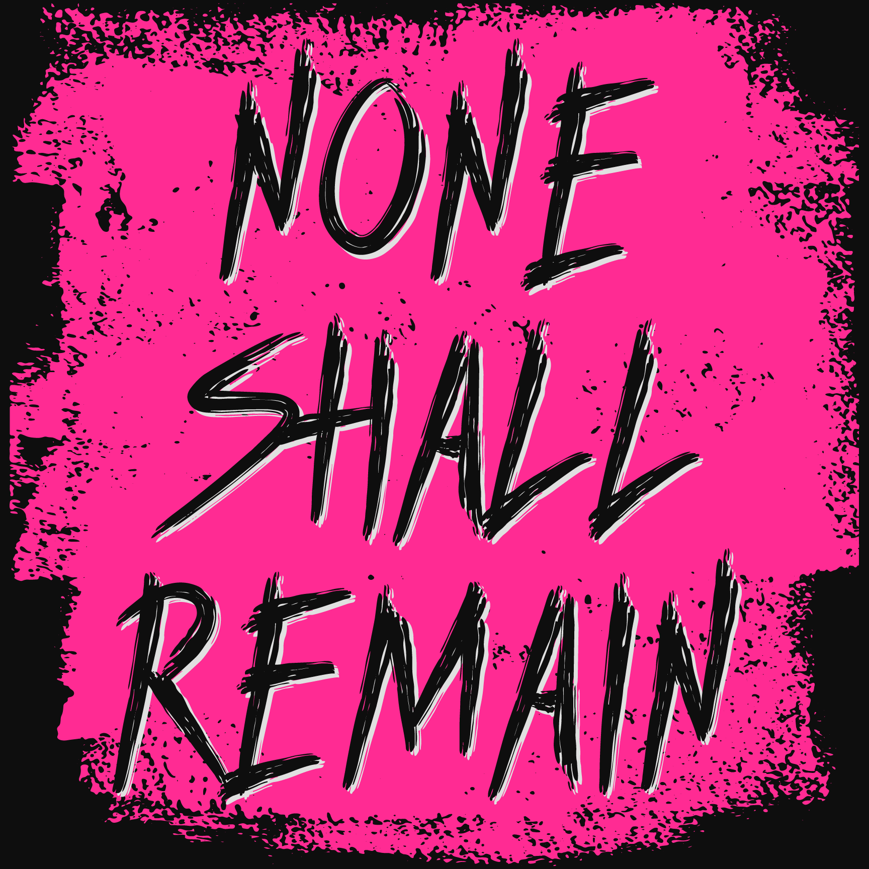
The high-contrast system translated naturally to physical pieces. The shirt and sticker retain the same raw typography and limited palette used across the digital campaign.
The result was not a single campaign look, but a visual toolkit: recognizable enough to build continuity and flexible enough to support different songs, shows, formats, and client-directed revisions.